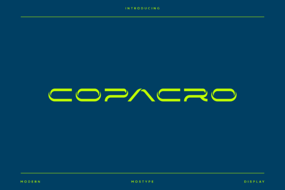
Copacro Font Free Download – Windows, Mac, Linux
Copacro Font: The Ultimate Modern Futuristic Typeface
In the realm of typography, few fonts have managed to capture the essence of modern futurism as effectively as Copacro. This sleek, futuristic display typeface is engineered to make a statement, combining grid-driven geometry with angular cuts, squared bowls, and clean joins to deliver a sharp, high-tech voice. Whether you’re a designer, craftsperson, or simply a typography enthusiast, Copacro is a font that demands attention.
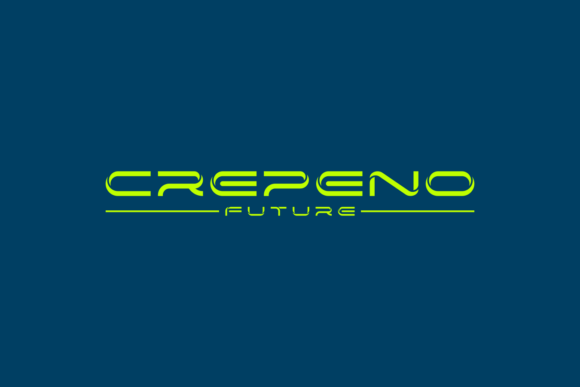
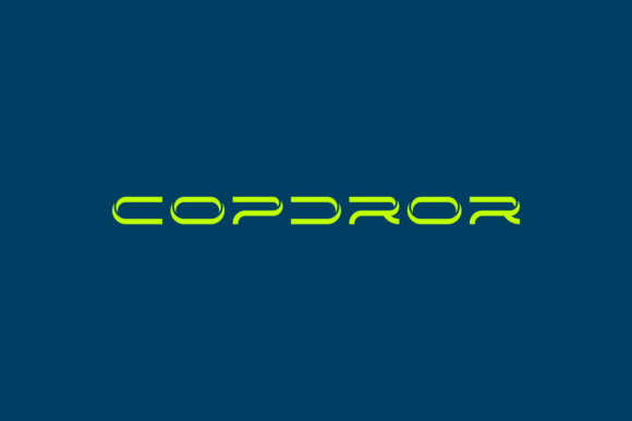
📸 Font Preview Gallery
Commercial license included • Instant download • No registration required
Design Characteristics
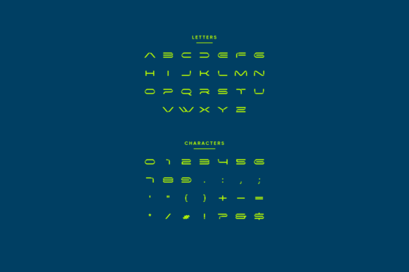
Copacro’s design is characterized by its all-caps alphabet, tight spacing, open counters, and consistent stroke weight. These features work in harmony to keep the font crisp on screens and signage, while the mechanical rhythm makes wordmarks and short headlines feel engineered and precise. The font’s grid-driven geometry and angular cuts give it a futuristic feel, while the squared bowls and clean joins add a touch of sophistication.
Use Cases
Copacro is a versatile font that can be used in a wide range of applications. Some of the most suitable use cases include:
- Sci-fi movie titles: Copacro’s futuristic design makes it an ideal choice for sci-fi movie titles, adding a touch of otherworldliness to your project.
- Esports and gaming logos: The font’s sharp, high-tech voice is perfect for esports and gaming logos, conveying a sense of speed, agility, and competition.
- UI headers: Copacro’s clean design and consistent stroke weight make it an excellent choice for UI headers, adding a touch of modernity to your interface.
- Automotive and aerospace branding: The font’s futuristic feel and mechanical rhythm make it an ideal choice for automotive and aerospace branding, conveying a sense of innovation and precision.
- Crypto and startup identities: Copacro’s modern design and sharp lines make it a popular choice for crypto and startup identities, adding a touch of sophistication and cutting-edge technology.
- Event posters: The font’s bold, futuristic design makes it an excellent choice for event posters, grabbing the attention of your audience and conveying a sense of excitement.
- Motion graphics: Copacro’s clean design and mechanical rhythm make it an ideal choice for motion graphics, adding a touch of modernity and sophistication to your project.
Tips for Using Copacro
To get the most out of Copacro, here are a few tips to keep in mind:
- Set it big: Copacro is a display font, and it’s best used at larger sizes. This will allow you to take full advantage of its futuristic design and sharp lines.
- Letter space for a cinematic vibe: Adding a bit of letter spacing can give Copacro a cinematic feel, making it perfect for movie titles, posters, and other applications where you want to make a statement.
- Layer outlines and neon: For a pure future aesthetic, try layering outlines and neon effects over your Copacro text. This will add a touch of depth and dimensionality to your design.
Copacro Font: Access Download Now
| Font Name | Copacro Font |
| Author | adabsubandi |
| Download | Access Download Here |
Conclusion
Copacro is a modern futuristic typeface that’s perfect for designers and craftspersons looking to add a touch of cutting-edge technology to their projects. With its sleek design, sharp lines, and mechanical rhythm, Copacro is an ideal choice for a wide range of applications, from sci-fi movie titles to esports logos and UI headers. By following the tips outlined above, you can get the most out of Copacro and add a touch of tomorrow’s attitude to your design today.
Key Features
- All-caps alphabet: Copacro features a sleek, all-caps alphabet that’s perfect for display text.
- Grid-driven geometry: The font’s grid-driven geometry gives it a futuristic feel and a sense of precision.
- Angular cuts: Copacro’s angular cuts add a touch of sophistication and sharpness to the font.
- Squared bowls: The font’s squared bowls give it a clean, modern feel.
- Clean joins: Copacro’s clean joins help to create a sense of flow and continuity.
- Tight spacing: The font’s tight spacing helps to create a sense of urgency and precision.
- Open counters: Copacro’s open counters add a touch of elegance and sophistication.
- Consistent stroke weight: The font’s consistent stroke weight helps to create a sense of cohesion and balance.