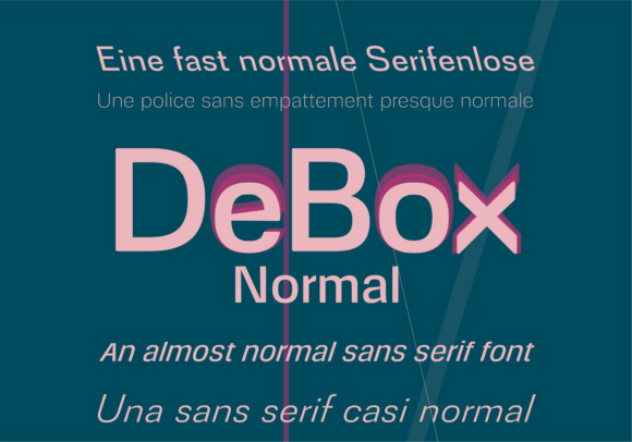
Debox Normal Font Free Download – Windows, Mac, Linux
Unveiling DeBox Normal Font: The Almost Normal Typeface Redefining Modern Versatility
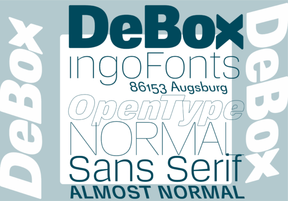
In the realm of typography, few font families manage to strike a balance between modernity and timelessness. DeBox, however, stands out as a masterclass in contemporary versatility, positioning itself as “almost normal” but deriving its power from this subtle subversion. This clean, neo-grotesque aesthetic, infused with a tech-forward energy, makes DeBox feel both grounded and futuristic. Let’s dive deeper into what makes DeBox a unique addition to the world of typography.
📸 Font Preview Gallery
Commercial license included • Instant download • No registration required
The Aesthetic of DeBox: A Blend of Familiarity and Innovation
DeBox’s design is characterized by its slightly boxy proportions and shapes. Unlike traditional sans serifs with perfectly round curves, DeBox tends noticeably towards rectangles, offering a fresh take on familiar forms. This distinctive approach to typeface design doesn’t stray far from the beaten path but introduces a contemporary twist that sets it apart. The proportions are unobtrusive and based on well-known typefaces, making DeBox an “almost normal sans serif.”

What Sets DeBox Apart: Unique Features
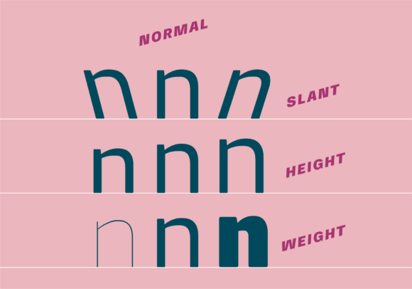
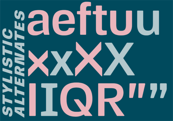
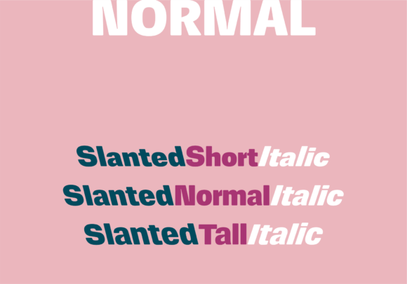
While DeBox shares many qualities with everyday fonts, a few special features distinguish it from the crowd. One of its standout offerings is the inclusion of variations not commonly found in standard typefaces. In addition to the conventional italics, DeBox also features a slanted version inclined to the left, against the reading direction. This contrasts with the typical italic forms seen in most modern fonts, which usually borrow from handwriting.
DeBox’s approach to italics and slanted versions offers designers a wider range of expressive possibilities. The absence of “real” italics, in favor of a slanted version, provides a subtle differentiation that can be particularly useful in design projects requiring a nuanced typographic hierarchy.
Versatility in Design: Applications of DeBox
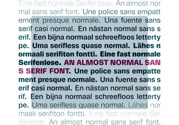
The versatility of DeBox makes it suitable for a wide range of design applications. Its clean lines and neo-grotesque aesthetic lend themselves well to digital platforms, while its slightly boxy proportions ensure it remains legible across various sizes and resolutions. Whether used in UI/UX design, digital publishing, or branding, DeBox offers a reliable and contemporary look that can adapt to the evolving needs of modern design.
Digital and Print: A Seamless Transition
One of DeBox’s significant strengths is its ability to transition seamlessly between digital and print formats. In digital media, its clarity and tech-forward aesthetic make it highly readable on screens. In print, its slightly boxy characters ensure that text remains engaging and clear, even at smaller sizes.
Conclusion: The Power of “Almost Normal”
DeBox Normal Font embodies the concept of “almost normal,” deriving its unique power from this subtle deviation. Its blend of neo-grotesque aesthetic, modern versatility, and tech-forward energy positions it as a valuable tool for designers and crafters. Whether you’re working on a digital project, a branding campaign, or a print publication, DeBox offers a distinctive yet familiar look that can elevate your design.
As typography continues to evolve, embracing innovation while respecting tradition, DeBox stands as a testament to the potential of typefaces that dare to be “almost normal.” Its unique features, coupled with its versatile applications, make DeBox a font family worth exploring for anyone looking to add a contemporary touch to their designs.
Getting Started with DeBox
For designers and crafters interested in integrating DeBox into their projects, the process begins with understanding the font’s unique characteristics and how they can be leveraged. Experimenting with DeBox’s variations, including its slanted versions, can open up new creative avenues. Additionally, exploring typography best practices and pairing DeBox with complementary fonts can help maximize its potential.
In conclusion, DeBox Normal Font is not just another typeface; it’s a reflection of modern design’s evolving landscape. Its balance of familiarity and innovation makes it a compelling choice for projects seeking a fresh yet grounded aesthetic.
Debox Normal Font: Access Download Now
| Font Name | Debox Normal Font |
| Author | ingoFonts |
| Download | Access Download Here |