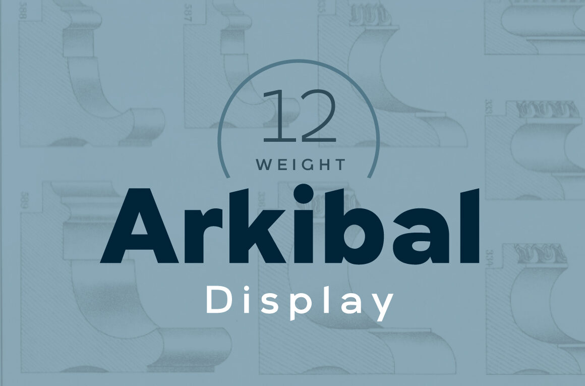
Arkibal Display Font Free Download – Windows, Mac, Linux
Introducing Arkibal Display Font: A Unique Typeface Inspired by History
The world of typography is vast and diverse, with countless fonts to choose from, each with its own story to tell. One such font that has caught the attention of designers and crafters alike is the Arkibal Display Font. This stunning typeface has a rich history behind it, and its unique design makes it a standout in the world of typography.
📸 Font Preview Gallery

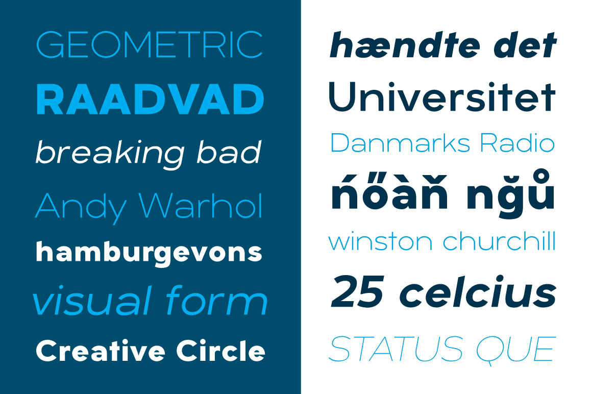
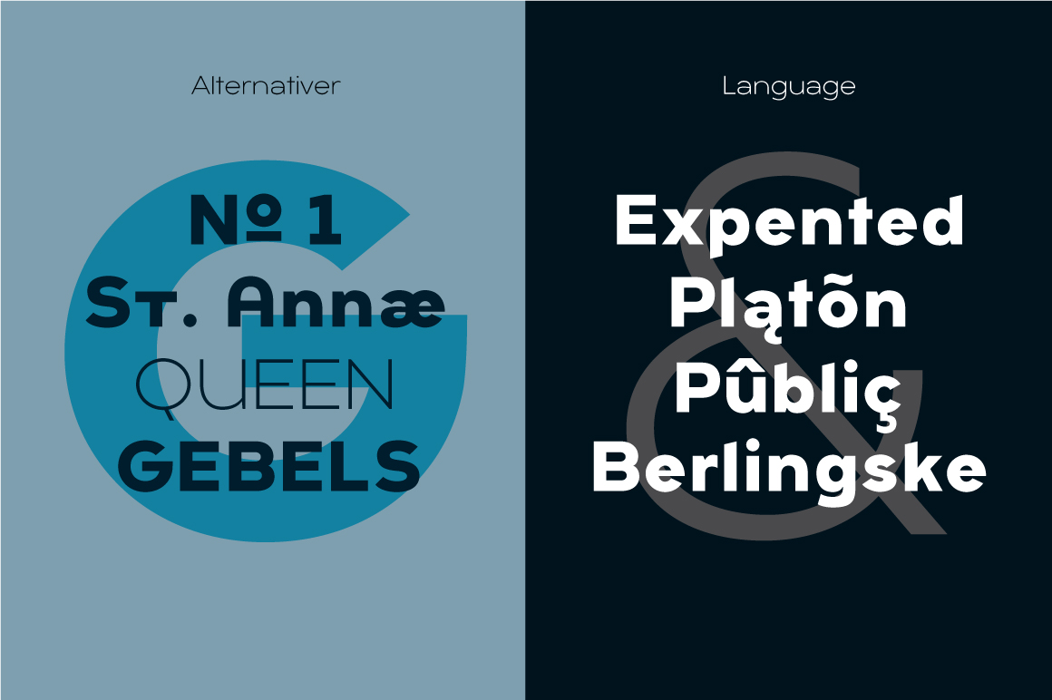
Commercial license included • Instant download • No registration required
The Inspiration Behind Arkibal Display Font
The Arkibal Display Font is inspired by old documents and store signs from a gold frame factory owned by the author’s great-grandfather. The factory, established in 1838, was renowned for its high-quality gold frames, which were sought after by many artists of that time and various museums in Copenhagen. The author’s great-grandfather was a skilled craftsman who delivered beautiful gold frames to some of the most prominent artists and museums of his era.
The Design of Arkibal Display Font
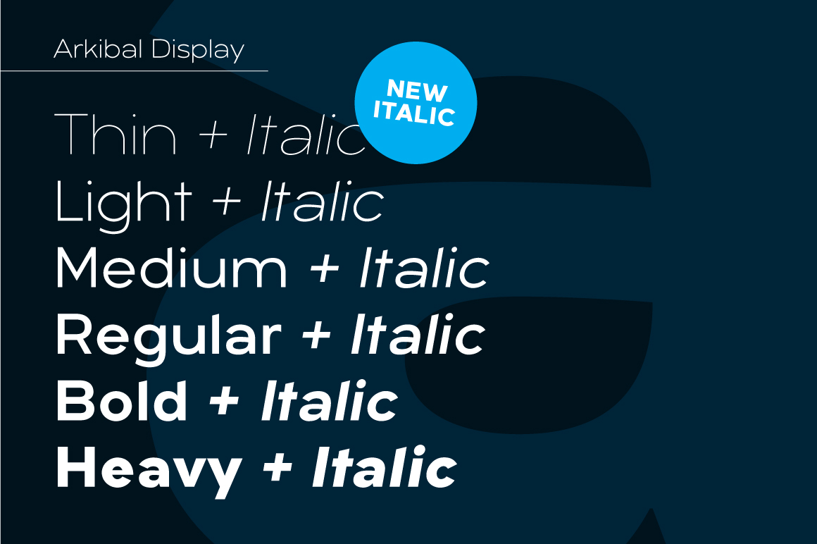
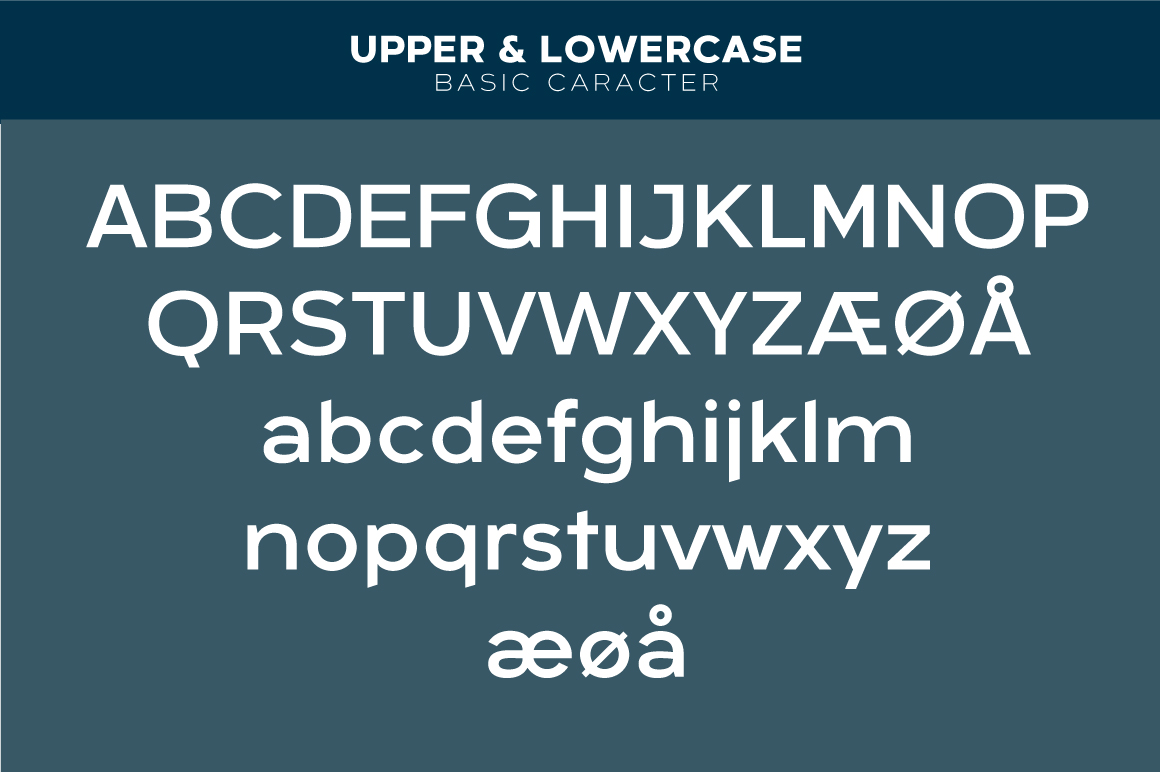
The display version of Arkibal is a little different from the Arkibal Sans family. In the display version, the letter “a” is the center of the whole font, and the letters “l, b, d, p, q, and t” are displayed on a slight angle. This design decision was made to create a dynamic and solid structure. The idea was to make two versions with a different selection of letters, providing a good balance between the two.
The Significance of the Letter “G”
The uppercase “G” was the first letter designed for the Arkibal Display font and serves as its starting point. In Danish, “G” stands for “Guldramme,” which means “Goldframe.” This pays homage to the author’s great-grandfather’s gold frame factory and the rich history behind the font. The name “Arkibal” comes from an old Danish traditional name “Arkibald,” minus the “d.”
What Makes Arkibal Display Font Unique?
The Arkibal Display Font is a unique typeface that stands out from the crowd. Its distinctive design, inspired by old documents and store signs, gives it a vintage feel that is hard to resist. The font’s design is a perfect blend of old and new, making it suitable for a wide range of design projects, from branding and advertising to packaging and signage.
Key Features of Arkibal Display Font
- Unique Design: The font’s design is inspired by old documents and store signs, giving it a distinctive vintage feel.
- Dynamic Structure: The display version of Arkibal has a dynamic structure, with the letter “a” as the center of the font and the letters “l, b, d, p, q, and t” displayed on a slight angle.
- Rich History: The font is inspired by the author’s great-grandfather’s gold frame factory, adding a touch of history and nostalgia to its design.
- Versatile: The Arkibal Display Font is suitable for a wide range of design projects, from branding and advertising to packaging and signage.
Why Designers and Crafters Love Arkibal Display Font
Designers and crafters love the Arkibal Display Font for its unique design and rich history. The font’s vintage feel and dynamic structure make it a standout in the world of typography. Its versatility and wide range of applications make it a popular choice among designers and crafters.
Arkibal Display Font: Access Download Now
| Font Name | Arkibal Display Font |
| Author | Jan-Christian Bruun |
| Download | Access Download Here |
Conclusion
The Arkibal Display Font is a stunning typeface that is sure to capture the attention of designers and crafters alike. Its unique design, inspired by old documents and store signs, gives it a distinctive vintage feel. With its dynamic structure, rich history, and versatility, the Arkibal Display Font is a great addition to any design project.