
Burntodeath Regular Font Free Download – Windows, Mac, Linux
Burn to Death Typeface: Unleashing Horror and Elegance in Design
In the realm of typography, certain fonts make a statement by evoking emotions and atmospheres that can elevate a design from ordinary to extraordinary. The Burn to Death Regular Font is one such typeface that commands attention with its sharp wedge-serif design, perfect for creating horror posters, game covers, album art, or Halloween branding that demands a lasting impression.
📸 Font Preview Gallery
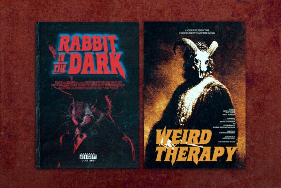
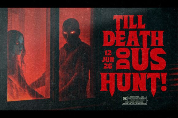
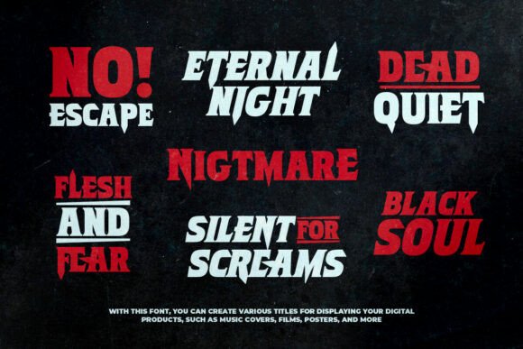
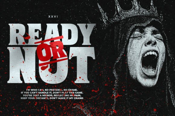
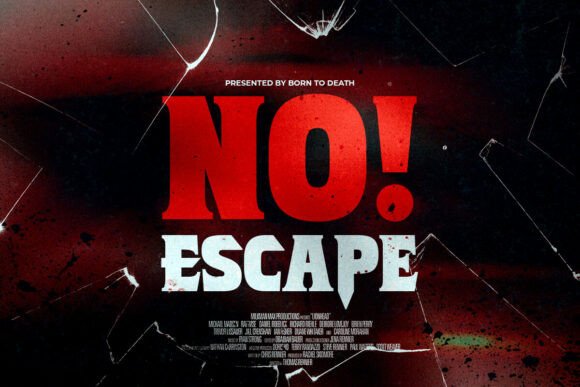
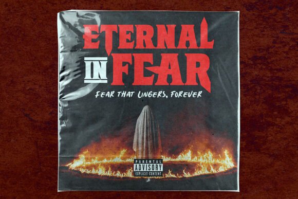
Commercial license included • Instant download • No registration required
The Anatomy of Burn to Death Font
The Burn to Death font is characterized by its heavy, condensed serif skeleton that transforms into jagged, blade-like terminals and skewed cuts. This unique feature gives every letter a carved, menacing feel that is hard to ignore. The triangular spurs, flared stems, and exaggerated overshoots contribute to a sense of motion, adding dynamism to the static letters on a page.
Texture and Background
One of the standout features of the Burn to Death font is its texture, which reads like scorched metal or stone. This distinctive quality makes it particularly effective on dark backgrounds with high contrast, where the font’s sharp angles and unique silhouettes can become the focal point of any design. The contrast not only enhances the readability of the font but also amplifies its dramatic effect, making it a showstopper in horror-themed designs or any project that requires a bold statement.
Design Tips for Using Burn to Death Font
To maximize the impact of the Burn to Death font, it’s recommended to use it in all caps. This not only maintains consistency with its intended design but also ensures that the message conveyed is strong and commanding. When setting the font in all caps, pay attention to tracking and line spacing. Tight tracking can create a compact, impactful look, while generous line spacing can prevent the text from feeling overcrowded and ensure legibility.
For body copy or supplementary text, it’s advisable to use a neutral sans or slab serif font. This contrast helps preserve legibility and prevents the overall design from becoming too overwhelming or difficult to read. The Burn to Death font is meant to be a headline or title font, drawing attention and setting the tone for the rest of the design.
Enhancing with Overlays and Gradients
The Burn to Death font pairs exceptionally well with design elements that enhance its dramatic and somewhat eerie feel. Gritty overlays can add texture and depth, making the text seem more integrated into the background. Wide drop shadows can create a sense of volume and dimension, giving the letters a more three-dimensional appearance.
Another technique to consider is applying red-to-orange “ember” gradients. This color scheme not only complements the scorched, burnt feel of the font but also adds a sense of heat and intensity. Such gradients can make the text appear as if it’s burning or smoldering, further enhancing the horror or dramatic effect intended by the design.
Best Practices for Display and Legibility
Given its unique design and texture, the Burn to Death font is best used at large sizes where its sharp angles and distinctive silhouettes can become the visual hook of a design. At smaller sizes, some of the intricate details and the texture may be lost, diminishing the font’s impact.
Legibility is key when working with any font, and the Burn to Death typeface is no exception. While it’s designed to make a statement, it should still be easy to read, especially in headlines or titles. Ensuring sufficient contrast between the text and the background, and avoiding overly complex backgrounds, can help maintain legibility.
Burntodeath Regular Font: Access Download Now
| Font Name | Burntodeath Regular Font |
| Author | saridezra |
| Download | Access Download Here |
Conclusion
The Burn to Death Regular Font is a powerful tool for designers looking to add a touch of horror, drama, or elegance to their projects. Its unique wedge-serif design, combined with its texture resembling scorched metal or stone, makes it perfect for a variety of applications, from horror posters and game covers to Halloween branding and album art. By following best practices for typography and design, designers can harness the full potential of this font, creating visually striking and memorable pieces that leave a lasting impression.
Whether you’re a professional designer or a crafting enthusiast, the Burn to Death font offers a wide range of creative possibilities. Its ability to evoke emotion and create a specific atmosphere makes it a valuable addition to any design toolkit. So, if you’re looking to make a bold statement and take your designs to the next level, consider incorporating the Burn to Death Regular Font into your next project.