Debora Fairley Font Free Download – Windows, Mac, Linux
Introducing Debora Fairley Font: The Epitome of Luxury Minimalism
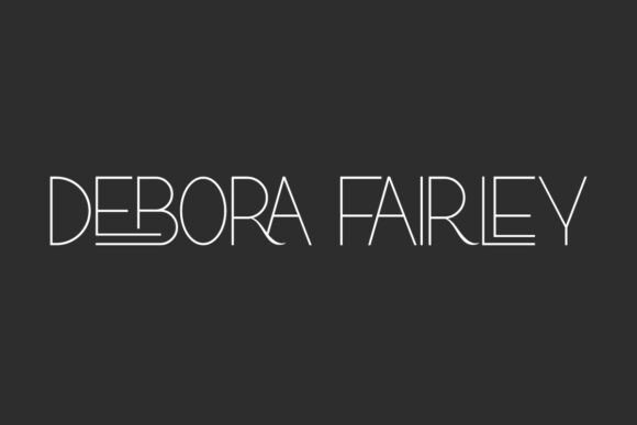
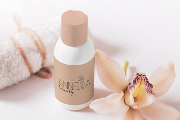
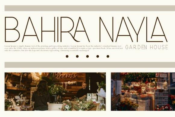
In the realm of typography, few fonts manage to convey the essence of luxury and sophistication as effectively as Debora Fairley. This high-end display font has been meticulously crafted to embody the “luxury minimalist” aesthetic, making it an indispensable asset for designers and crafters aiming to infuse their projects with a touch of modern elegance.
📸 Font Preview Gallery
Commercial license included • Instant download • No registration required
The Design Philosophy Behind Debora Fairley
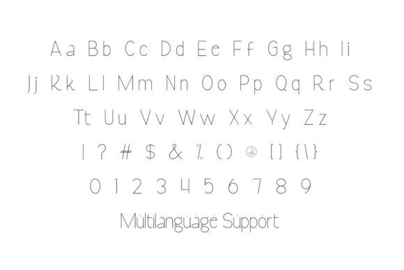
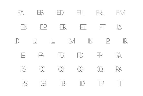
Debora Fairley is distinguished by its exceptionally tall, slender letterforms, which are rendered with a hairline monoline stroke weight. This design choice lends the font an air of refinement and poise, setting it apart from more conventional typefaces. The font’s most striking feature, however, is the horizontal swashes that underline the “D” and “Y.” These swashes not only add a unique flair to the text but also impart a grounded, signature-like quality that is hard to achieve with standard fonts.
Ideal Applications for Debora Fairley
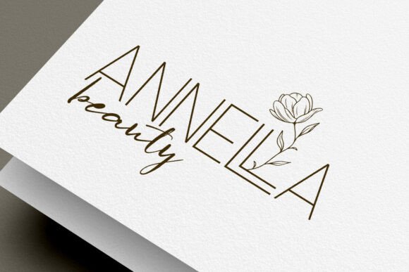
Given its sophisticated and luxurious appearance, Debora Fairley is perfectly suited for a variety of high-end applications. Some of the most notable uses for this font include:
- High-Fashion Branding: Debora Fairley’s elegant and refined aesthetic makes it an excellent choice for fashion brands looking to convey a sense of luxury and exclusivity.
- Luxury Real Estate Identities: For real estate companies that specialize in high-end properties, this font offers a sophisticated way to brand their identities and marketing materials.
- Upscale Editorial Titles: The font’s modern elegance and minimalist luxury make it ideal for use in editorial titles, adding a touch of sophistication to any publication.
- Professional Signature Watermarks: Debora Fairley’s unique and elegant design also makes it suitable for use as a signature watermark, allowing professionals to add a personal and luxurious touch to their documents and correspondence.
Why Choose Debora Fairley?
When it comes to selecting a font for a project, designers and crafters have a multitude of options at their disposal. However, Debora Fairley stands out for several reasons:
- Uniqueness: Its distinctive design ensures that any project using Debora Fairley will have a unique and memorable appearance.
- Versatility: Despite its specific luxury minimalist aesthetic, Debora Fairley can be adapted to a wide range of projects, from fashion and real estate to editorial and professional branding.
- Elegance: The font’s inherent elegance and sophistication make it an excellent choice for any project aiming to convey a sense of high-end quality.
Tips for Using Debora Fairley Effectively
To maximize the impact of Debora Fairley in your projects, consider the following tips:
- Pair with Complementary Fonts: While Debora Fairley is stunning on its own, it can be even more effective when paired with complementary fonts that enhance its luxurious aesthetic.
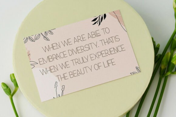
- Use in Headlines and Titles: The font’s elegance and sophistication make it particularly well-suited for headlines and titles, where it can make a significant impact.
- Experiment with Color: While Debora Fairley looks striking in black or dark colors, experimenting with metallic or pastel colors can add a unique twist to its appearance.
Debora Fairley Font: Access Download Now
| Font Name | Debora Fairley Font |
| Author | vintype |
| Download | Access Download Here |
Conclusion
Debora Fairley is more than just a font; it’s a statement of luxury and sophistication. Its unique blend of modern elegance and minimalist design makes it an invaluable asset for designers and crafters looking to elevate their projects. Whether you’re working on high-fashion branding, luxury real estate identities, upscale editorial titles, or professional signature watermarks, Debora Fairley offers a level of refinement and poise that is hard to match. By incorporating Debora Fairley into your typographic arsenal, you’re not just choosing a font—you’re choosing to make a statement.